Empowering Teachers and Admins with Real-Time School Dashboards
I still remember walking into a staff meeting where every report felt like ancient history. Attendance figures were two weeks old. Test scores arrived as PDFs. Teachers were juggling spreadsheets while trying to plan lessons. Sound familiar? Schools are busy places. We need tools that keep up with the day to day, not tools that slow us down.
Real-time dashboards make this difference. They provide educators and school leaders instant access to the key factors most important to them: attendance, behavior incidents, assessment results, resource usage, and so on. From my point of view, the contrast between receiving a report once a month and accessing data in real-time is similar to changing from dial-up to fiber internet. Immediately, the decisions become quicker, mentoring more efficient and the small problems remain small.
What I Mean by Real-Time Dashboards
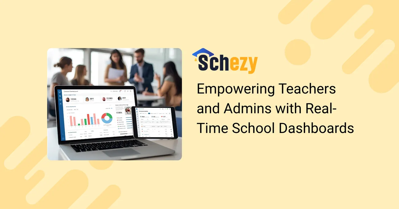
Real-time dashboards, in my opinion, are basically user interfaces that fetch data from your systems on the go and display them in easy-to-understand charts, tables, and alerts. A teacher can view the class roster, find out who is absent, and know which students require follow-up. Admins are provided with a quick overview of the school’s attendance, finances, and staffing. The patterns can be quickly noticed by the principals and they can act before the situation escalates. These dashboards belong to a school ERP ecosystem, thus, they are not separate gadgets.
Real-time does not mean noisy. The best dashboards surface the right signals, not every log. They help people focus on decisions, not on chasing data.

Why Schools Need Dashboards Now
- Fast decisions matter: Interventions for attendance, behavior, or learning gaps are more effective when you catch issues early.
- Staff are stretched thin: Teachers and admins need tools that save time, not add work.
- Parents expect timely updates: Families want clarity about attendance, progress, and events.
- Accountability is constant: Regulatory reporting and accreditation demand accurate, auditable records.
Dashboards solve all of these by turning raw data into clear action. You see a trend, you act. You don’t wait for the next meeting because you already have the picture.
Core Dashboard Types and Who Benefits
Different roles use dashboards differently. Here’s a breakdown that maps needs to real features.
Teacher Dashboards
- Daily class roster with real-time attendance and tardy flags.
- Homework and assessment tracker that rolls up student performance across standards.
- Behavior notes and intervention logs tied to individual students.
- Quick filters for at-risk groups so teachers can plan small group work.
Teachers tell me they want one screen that answers: who’s missing, who’s falling behind, and what should I do this week. When dashboards give that at a glance, lesson planning gets easier and parent conversations feel grounded in facts.
Admin Dashboards
- Attendance heatmaps by grade and time of day.
- Staffing and substitution needs with cost estimates.
- Finance summaries: fee collections, budget vs actual, and outstanding payments.
- Compliance trackers for immunizations, background checks, and certifications.
Principals and office managers use these dashboards to schedule resources, forecast costs, and reduce surprises. A live admin dashboard often trims hours off weekly reporting tasks.
District and Superintendent Dashboards
- School-by-school comparisons on attendance, test outcomes, and enrollment trends.
- Budget allocation and expenditure visibility across schools.
- Performance alerts for schools that need targeted supports.
At the district level, dashboards help leaders spot patterns across schools. They’re great for strategic resource allocation and for making the case to boards or funders.
Concrete Examples: Dashboards in Action
Examples help me make the case to school leaders because they answer the question: how will this actually change the work? Here are three quick scenarios I’ve seen work in real schools.
Example 1: Cutting Chronic Absence
Problem: A middle school noticed rising unexcused absences by Grade 7 but only discovered the trend at month end.
Dashboard fix: An attendance dashboard showed daily absence percentages by homeroom and flagged students with three or more unexcused days in a week. The attendance officer set automated alerts to the counselor and the family liaison.
Result: Early outreach prevented patterns from hardening. After two months attendance improved and chronic absence referrals dropped by 25 percent. In plain terms, fewer kids were missing school and interventions landed sooner.
Example 2: Supporting Struggling Readers
Problem: Teachers suspected certain students were falling behind on reading skills but progress monitoring was scattered across paper forms and spreadsheets.
Dashboard fix: A mastery dashboard pulled assessment data into a simple dashboard that grouped students by standard. Teachers could quickly assign small-group instruction to the lowest tier and monitor gains week to week.
Result: Teachers reported better lesson targeting and saved time on paperwork. Students moved from red to amber to green more predictably because teachers adjusted instruction faster.
Example 3: Streamlined Sub Management
Problem: Substitute costs were rising and the office had no clear forecast of when subs were needed.
Dashboard fix: A staffing dashboard tracked teacher absences and projected sub needs for the week. It showed the most common days and subject areas needing coverage.
Result: The district reduced emergency subs by restructuring PD schedules and shifted some planning days to lighter coverage days, saving money and making teacher schedules more predictable.
What Makes a Dashboard Effective
Not all dashboards are created equal. I’ve seen gorgeous dashboards that don’t help anyone because they’re full of noise. Here are principles I recommend.
- Focus on decisions: Every graph should provide an answer to a question which is likely to be taken into consideration by someone. If a chart doesn’t do this, then get rid of it.
- Keep it simple: Just one or two main figures per page are enough to lower the user's mental load.
- Use plain language: Don’t use acronyms even if they are common unless everyone agrees on their meaning.
- Make it actionable: Besides that, have the following actions or hyperlinks to the corresponding workflow, like sending a message to the parents or making a behavior plan.
- Role-based views: Teachers, office staff, and principals get what they need, i.e. they see what is relevant to them by default.
- Mobile friendly: Teachers and coaches are on their phones. They often do a quick check from their phone. So, responsive design is really important.
- Audit trails and privacy: Make sure that the log of data access and the setting of permissions by role to protect student information are in place.
One small tip I share with schools: start with the questions staff ask most in weekly meetings. Build dashboards that answer those. It’s faster and it gets buy-in.
Common Pitfalls and How to Avoid Them
When implementing dashboards, schools run into a few predictable problems. I’ll be blunt: these are avoidable.
- Data overload: Too many charts and no clear action. Fix by pruning metrics and focusing on a few KPIs.
- Stale integrations: If the dashboard pulls from spreadsheets, it will never be truly real-time. Integrate directly with your student information system and other tools.
- Poor adoption: Staff ignore dashboards that feel remote or too technical. Offer short training, quick reference guides, and show real use cases in staff meetings.
- Bad data quality: Garbage in, garbage out. Build routines to clean and validate data and set accountability for data entry.
- Security gaps: Mishandled permissions can leak sensitive data. Use role-based access and regular audits.
One school I worked with fixed adoption by pairing a teacher champion with an admin. They ran a two-week pilot focused on one need: reducing late arrivals. The pilot gave fast wins and helped the rest of staff see the value.
Practical Steps to Roll Out Real-Time Dashboards
Rolling out dashboards doesn’t have to be a drawn-out project. Here’s a step-by-step plan that’s doable in a single semester.
- Identify pain points: Ask teachers and admins what keeps them up at night. Pick one to solve first.
- Choose a pilot group: Start with a single grade or department to keep scope manageable.
- Map data sources: List where the necessary data lives: SIS, LMS, finance system, attendance kiosks, spreadsheets.
- Design a simple dashboard: Build a view that answers the pilot group’s main question. Keep it to one screen.
- Train and collect feedback: Run a short training and collect feedback after one and three weeks. Iterate fast.
- Measure impact: Track simple metrics like time saved on reporting, reduction in days to intervention, or a drop in chronic absence.
- Scale up: Roll the approach to other grades or schools, repeating the pilot rhythm.
Small pilots reduce risk and provide stories you can use to get buy-in. People respond to proof, not promises.
How Dashboards Fit Inside a School ERP
Dashboards are not a stand-alone silver bullet. They belong to a school ERP that connects student records, finance, HR, communications, and classroom tools. When dashboards sit on top of an integrated ERP the benefits multiply.
- Real-time updates without manual exports.
- Linked workflows so an alert can create a task, send a message, or launch an intervention plan.
- Consistent student profiles across systems, so teachers see the same data the counselors do.
Schezy builds dashboards as part of its school ERP. That means when an attendance mark changes in class, the admin dashboard updates immediately. When a teacher logs a behavior note, the intervention tracker reflects it in real time. That kind of integration is what makes dashboards genuinely useful.
What to Look for When Evaluating Dashboard Tools
With so many products on the market, picking a dashboard can feel overwhelming. Here’s a checklist tuned for school decision-makers.
- Integration capability: Can it connect to your SIS, LMS, finance, and messaging tools?
- Real-time data feeds: Are updates instant or batched daily?
- Role-based views: Does it provide tailored screens for teachers, admins, and district staff?
- Action links: Can you drill from a chart into the workflow, like messaging a parent or creating a support plan?
- Customization: Can you configure KPIs without coding?
- Security and compliance: Does the vendor support data privacy standards and provide audit logs?
- Support and training: Do they offer onboarding, templates, and a community of schools using the tool?
One trap I see is picking the shiniest visualization instead of the most integrated solution. A pretty chart means little if the data is stale or locked in spreadsheets.

Measuring the Impact: What Success Looks Like
How will you know dashboards are making a difference? Here are practical metrics schools can track.
- Time saved: Hours per week teachers or admins stop spending on manual reporting.
- Response time: Days from issue identification to intervention.
- Attendance and chronic absence: Percentage point improvement after dashboard-driven outreach.
- Assessment turnaround: Speed from assessment to individualized action plan.
- Parent engagement: Increase in logins, messages, or attendance at conferences due to timely alerts.
- Cost savings: Reduced overtime, fewer emergency subs, or better resource forecasting.
Track a few of these and share the wins in staff meetings. That keeps momentum going and builds trust in the system.
Case Example: A Practical Rollout Story
Let me walk through a short, realistic story I’ve used in workshops. Call this Greenfield High.
Greenfield had rising tardies and a busy front office. They chose to pilot a real-time attendance dashboard integrated with their SIS through Schezy. The dashboard showed daily attendance by homeroom, late arrival hotspots, and families with recurring lateness.
They started small: one grade, four homerooms. Each morning teachers marked attendance and counselors saw any student flagged for three or more tardies in a week. Automated messages went to parents on the second tardy, and the counselor made a personal call on the fourth.
Within six weeks tardies fell by 30 percent in the pilot group. Teachers saved 20 minutes a day on follow-ups because the dashboard automated alerts. The principal used that positive result to fund a schoolwide rollout and to justify a small investment in parent engagement tools.
That’s not a huge miracle. It’s a practical application of real-time dashboards with a tight scope and clear measures. Small wins like these build momentum.
Tips for Building Teacher-Friendly Dashboards
Teachers will only use dashboards that help their workflow. Here are tips that work in the classroom.
- Keep the login easy: Single sign-on reduces friction.
- Highlight what’s urgent: Show critical items like missing attendance, urgent behavior alerts, and grading deadlines first.
- Allow notes: Teachers should be able to add quick comments that sync to the student profile.
- Give export options: Sometimes a simple CSV or printable list is all a teacher needs for parent conferences.
- Offer templates: Prebuilt views for different subjects and grade levels make adoption faster.
I’ve seen dashboards that became cluttered because each teacher wanted different things. The fix is to provide a default teacher view that covers essentials and optional widgets they can add.
Privacy, Permissions, and Professional Integrity
Remember, dashboards deal with sensitive data. Planning for privacy and permissions is not optional. You must agree on who sees what and why.
- Role-based access: Limit discipline details to staff who need them.
- Two-factor authentication: Use it for administrators and others with broad access.
- Regular audits: Periodically review who has access and why.
- Training on ethics: Staff should understand confidentiality expectations and legal obligations.
When schools treat data access casually it creates real risk. Set governance early and stick to it.
Costs and Return on Investment
People often ask if dashboards pay for themselves. Short answer: often they do, when you measure both time and outcomes.
Here’s a realistic way to estimate ROI. List current time spent on tasks like running attendance reports, chasing missing grades, or compiling weekly metrics. Multiply by staff salary rates to convert time into cost. Now compare that to the cost of a dashboard-enabled ERP, factoring in reduction of time spent and better outcomes like reduced chronic absence or better targeted interventions that lower remediation costs.
Many schools find the first-year savings come from time saved and reduced emergency staffing. Long term, better student outcomes and more efficient operations justify the investment.
Why Schezy for Real-Time Dashboards
If you’re comparing options, here’s why I point schools to Schezy. Schezy bundles school ERP features with powerful real-time dashboards designed for everyday school work. It’s built to connect to SIS, LMS, finance, and communication tools so the data you see is current and consistent.
- Teacher productivity tools: Gradebooks, attendance, lesson linking, and messaging all in one place.
- Admin dashboards: Live attendance, finance snapshots, and HR views that save time on weekly reports.
- Data analytics in education: Built-in analytics help you spot trends without complex BI tools.
- Classroom management software features: Behavior tracking, seating plans, and quick interventions tied to student profiles.
- Security and compliance: Role-based access and audit logs so you stay compliant.
Schezy’s approach is pragmatic. It focuses on the workflows teachers and admins actually use every day, not on dazzling dashboards that don’t change practice.
Getting Stakeholders on Board
Buy-in is half technical and half human. Use these tactics to get leaders, teachers, and parents aligned.
- Start with a problem: Present the dashboard as a solution to a real pain like chronic absence or inefficient reporting.
- Show a working pilot: People respond to demonstrated wins more than to promises.
- Use teacher champions: Teachers are more likely to adopt tools recommended by peers.
- Explain data use: Tell parents and staff how data will be used, stored, and protected.
- Celebrate quick wins: Share time saved and outcomes in staff newsletters and meetings.
I've noticed that when you celebrate small improvements, momentum builds quickly. People become curious and start using the dashboards creatively.
Simple Dashboard Examples You Can Ask For Tomorrow
If you’re ready to start conversations with vendors or your IT team, here are simple dashboards to request. They’re useful, fast to build, and prove value quickly.
- Daily Attendance Snapshot: Today’s attendance by homeroom with tardy counts and automated parent notice links.
- Assessment Progress: Recent quiz results with students grouped by mastery level so teachers can plan small groups.
- Behavior Incidents: A rolling 30-day list that shows frequency by student and type of incident.
- Fee Collections: Outstanding payments, upcoming due dates, and a quick way to send reminders.
- Sub Coverage Forecast: Upcoming teacher absences and predicted sub needs for the week.
Ask for these as defaults. They’ll solve common headaches and show the possibilities.
Also Read:
- Real-Time School Communication – Never Miss an Update Again
- National Board of Accreditation: How It Improves the Quality of Higher Education in India
Final Thoughts
Real-time school dashboards are not a fancy add-on. They are practical tools that make school life easier for teachers and administrators. From stopping chronic absence to helping teachers tailor lessons faster, dashboards turn scattered data into action.
If you’re just starting this journey, my advice is simple: start small, focus on one urgent problem, and measure the impact. Use role-based views, integrate with your ERP, and keep privacy front and center. The rest follows.
Small, fast wins create momentum. Dashboards are most powerful when they change what people do every day, not just what they know.
Helpful Links & Next Steps
Explore Schezy’s Smart Dashboard Features Today
Want to see a demo or talk through a pilot? Start with a small question and build from there. Dashboards don’t need to be perfect at launch. They just need to help someone make a better decision today.